Altair绘图自学成材
- 1。Altair介绍及安装必备(全名:Vega-Altair)
- 2。一步一步学画图
- (1) 从几个简单的例子学起
- 一个简单的直方图
- 一个用自定义图标显示在坐标轴里的图形
- 一张饼图
- 流行的鸢尾花iris数据集
- (2)语法入门
- 第一步,Chart Object对象转换
- 第二步,Marks and Encodings
- 标记(mark)
- 编码(encoding)
- Channel Options
- Encoding Data Types
- Encoding Shorthands
- 第三步,显示图形或保存结果(Saving Altair Charts)
- (1) 从几个简单的例子学起
- 3。复杂一些的样例
- 其他相关:
- 教程:
1。Altair介绍及安装必备(全名:Vega-Altair)
它是一个专为Python编写的可视化软件包,它能让数据科学家更多地关注数据本身和其内在的联系。
https://github.com/altair-viz/altair
安装:Vega-Altair can be installed with:
pip install altair
If you are using the conda package manager, the equivalent is:
conda install altair -c conda-forge
如果要显示图形,那么下面几个也是要安装的:
需要altair_viewer, altair-data-server的支持
pip install altair_viewer
pip install altair-data-server
项目地址:
http://github.com/altair-viz/altair_viewer
https://pypi.org/project/altair-data-server/#files
如果要把图形导出保存,则需要用到下面的库:altair_saver
介绍:https://altair-viz.github.io/user_guide/saving_charts.html#user-guide-saving
pip install altair_saver
或
conda install -c conda-forge altair_saver
有一些范例要用到一些数据,可以安装下面的样例数据库:vega-datasets
pip install vega-datasets
项目地址:
2。一步一步学画图
(1) 从几个简单的例子学起
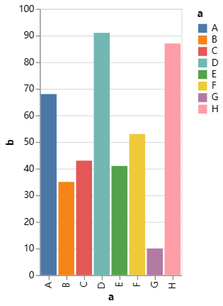
一个简单的直方图
import altair as alt
import altair_viewer
import pandas as pd

source = pd.DataFrame({
    'a': ['A', 'B', 'C', 'D', 'E', 'F', 'G', 'H'],
    'b': [68, 35, 43, 91, 41, 53, 10, 87]
})

chart = alt.Chart(source).mark_bar().encode(
    x='a',
    y='b',
    color="a"
)

chart.show()
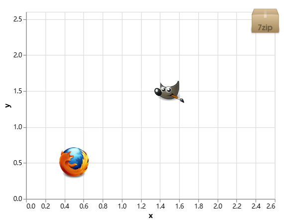
一个用自定义图标显示在坐标轴里的图形
import altair as alt
import altair_viewer
import pandas as pd

source = pd.DataFrame.from_records([
      {"x": 0.5, "y": 0.5, "img": "https://vega.github.io/vega-datasets/data/ffox.png"},
      {"x": 1.5, "y": 1.5, "img": "https://vega.github.io/vega-datasets/data/gimp.png"},
      {"x": 2.5, "y": 2.5, "img": "https://vega.github.io/vega-datasets/data/7zip.png"}
])

chart = alt.Chart(source).mark_image(
    width=50,
    height=50
).encode(
    x='x',
    y='y',
    url='img'
)

chart.show()
一张饼图
import pandas as pd
import altair as alt

source = pd.DataFrame({"category": [1, 2, 3, 4, 5, 6], "value": [4, 6, 10, 3, 7, 8]})

alt.Chart(source).mark_arc().encode(
    theta=alt.Theta(field="value", type="quantitative"),
    color=alt.Color(field="category", type="nominal"),
)
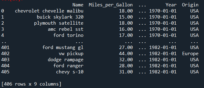
流行的鸢尾花iris数据集
数据模样:
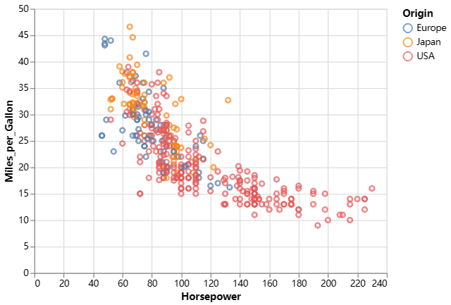
import altair as alt
from vega_datasets import data
import altair_saver

alt.renderers.enable('altair_viewer')

# load a simple dataset as a pandas DataFrame

cars = data.cars()
chart = alt.Chart(cars).mark_point().encode(
    x='Horsepower',
    y='Miles_per_Gallon',
    color='Origin',
).interactive()

chart.show()
chart.save('chart.png', engine="altair_saver")
感受一些不同:
具体可以参考:https://altair-viz.github.io/user_guide/encodings/index.html#encoding-data-types
import altair as alt
from vega_datasets import data
alt.renderers.enable('altair_viewer')

cars = data.cars()

base = alt.Chart(cars).mark_point().encode(
    x='Horsepower:Q',
    y='Miles_per_Gallon:Q',
).properties(
    width=250,
    height=250
)

alt.vconcat(
   base.encode(color='Cylinders:Q').properties(title='quantitative'),
   base.encode(color='Cylinders:O').properties(title='ordinal'),
   base.encode(color='Cylinders:N').properties(title='nominal'),
)

base.show()
(2)语法入门
Altair绘图三步走,在绘制可视化作品之前,我们需要导入绘图所需的数据,Altair库的数据导入格式是标准的Pandas.Dataframe类型,这也很大程度上完善了Python 数据可视化流程化过程,省去了数据转换的过程。
Altair可视化主要的「三大步骤」:
第一步,Chart Object对象转换
在进行Altair可视化绘制时,我们要将之前读取的的数据转换成可被Altair接受的绘图对象,这时候,我们需要调用Altair库的Chart() 方法将数据转换成Altair的Chart对象。Altair中的基本对象是Chart,它将dataframe作为单个参数。下面是一个参考样例:
import altair as alt
chart = alt.Chart(data) # data为要绘制的数据,Dataframe类型
一个图表对象Chart有三个基本方法:数据(data)、标记(mark)和编码(encode)
使用它们的格式如下:
alt.Chart(data).mark_point().encode(
  encoding_1='column_1',
  encoding_2='column_2',
)
标记(Encodings)和编码(Marks)则决定着绘制图表的样式,下面着重介绍这两部分。
第二步,Marks and Encodings
使用chart生成图表对象之后,就可以根据数据指定我们希望绘制的可视化作品。
标记(mark)
Altair库通过图表对象(Chart Object) 的 mark属性完成的,即可以通过Chart.mark_ *方法获取多种图表格式。
例如:我们可以使用 mark_point() 来绘制点图,代码如下:
alt.Chart(data).mark_point()
更多的图形种类包括:
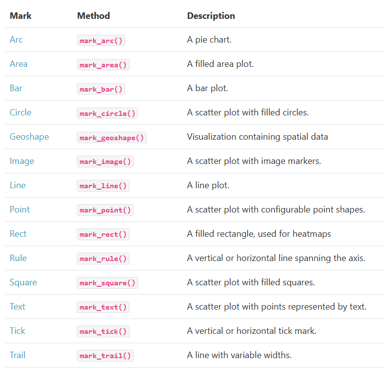
具体可以参考官网样例:
https://altair-viz.github.io/gallery/index.html#example-gallery
要注意的是,Mark具有多种属性(Properties),官网有详细介绍,主要包括以下几个方面
General Mark Properties
Position and Offset Properties
Color Properties
Stroke Style Properties
Hyperlink Properties
详见官网指引:https://altair-viz.github.io/user_guide/marks/index.html
编码(encoding)
对于encoding来说,有几个重要的性质,分别是channel, channel options, Encoding Data Types, Encoding Shorthands
对于encoding,官网是这么说的:
The key to creating meaningful visualizations is to map properties of the data to visual properties in order to effectively communicate information. In Altair, this mapping of visual properties to data columns is referred to as an encoding, and is most often expressed through the **Chart.encode() ** method.
For example, here we will visualize the cars dataset using four of the available encoding channels (see Channels for details): x (the x-axis value), y (the y-axis value), color (the color of the marker), and shape (the shape of the point marker):
import altair as alt
from vega_datasets import data

cars = data.cars()

alt.Chart(cars).mark_point().encode(
    x='Horsepower',  #channel 1
    y='Miles_per_Gallon',  #channel 2
    color='Origin',   #channel 3
    shape='Origin'   #channel 4
)
Channel Options
Each encoding channel accepts a number of channel options (see Channel Options for details) which can be used to further configure the chart. Altair 5.0 introduced a method-based syntax for setting channel options as a more convenient alternative to the traditional attribute-based syntax described in Attribute-Based Syntax (but you can still use the attribute-based syntax if you prefer).

Encoding Data Types
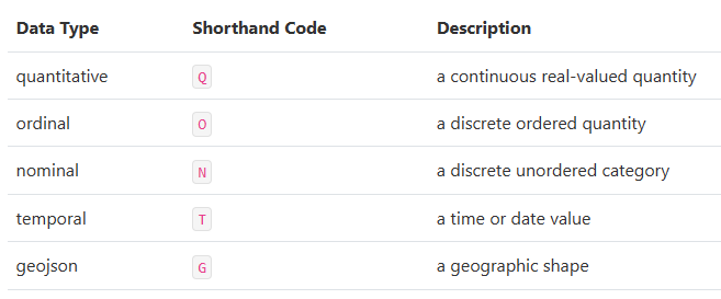
For data specified as a DataFrame, Altair can automatically determine the correct data type for each encoding, and creates appropriate scales and legends to represent the data.
If types are not specified for data input as a DataFrame, Altair defaults to quantitative for any numeric data, temporal for date/time data, and nominal for string data, but be aware that these defaults are by no means always the correct choice!
The types can either be expressed in a long-form using the channel encoding classes such as X and Y, or in short-form using the Shorthand Syntax discussed below. For example, the following two methods of specifying the type will lead to identical plots:
alt.Chart(cars).mark_point().encode(
    x='Acceleration:Q',
    y='Miles_per_Gallon:Q',
    color='Origin:N'
)
和下面这段代码是等效的:
alt.Chart(cars).mark_point().encode(
    alt.X('Acceleration', type='quantitative'),
    alt.Y('Miles_per_Gallon', type='quantitative'),
    alt.Color('Origin', type='nominal')
)
Encoding Shorthands
For convenience, Altair allows the specification of the variable name along with the aggregate and type within a simple shorthand string syntax. This makes use of the type shorthand codes listed in Encoding Data Types as well as the aggregate names listed in Binning and Aggregation. The following table shows examples of the shorthand specification alongside the long-form equivalent:

以上详见官网:https://altair-viz.github.io/user_guide/encodings/index.html
第三步,显示图形或保存结果(Saving Altair Charts)
3。复杂一些的样例
其他相关:
图库示例:https://altair-viz.github.io/gallery/
用户手册:https://altair-viz.github.io/user_guide/data.html#user-guide-data
更多encode()方法,大家可以参照以下网址进行了解:
https://altair-viz.github.io/user_guide/encoding.html
教程:
https://blog.csdn.net/pyjishu/article/details/115768951
https://zhuanlan.zhihu.com/p/452820776