五彩线条
今天,我想与你们分享一张我最近发现的五彩线条图,它不仅以其绚丽的色彩吸引我,更以其独特的图案和深邃的内涵让我着迷。这张图不仅仅是一幅简单的视觉作品,它是对复杂数据的直观呈现,是对抽象概念的具象表达。
图中的线条,如同我们生活中的轨迹,时而上升,时而下降,交织出一个个精彩的故事。色彩的渐变,如同我们情感的波动,从热烈到冷静,从明亮到暗淡,每一处变化都蕴含着深意。
我希望通过分享这张图,我们能一起探索它背后的故事,感受它带给我们的启示。也许,它能够激发我们对世界的新看法,或是引发我们对某个问题的深入思考。
图案
代码解读
点击查看代码
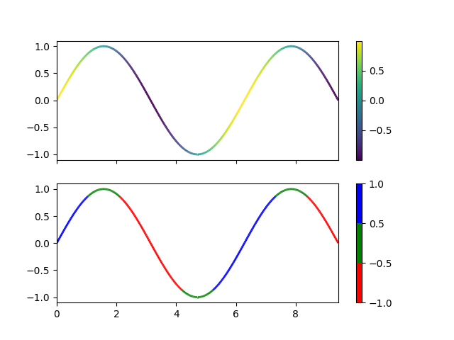
import numpy as np
import matplotlib.pyplot as plt
from matplotlib.collections import LineCollection
from matplotlib.colors import ListedColormap, BoundaryNorm

x = np.linspace(0, 3 * np.pi, 500)
y = np.sin(x)
dydx = np.cos(0.5 * (x[:-1] + x[1:]))  # first derivative

# Create a set of line segments so that we can color them individually
# This creates the points as a N x 1 x 2 array so that we can stack points
# together easily to get the segments. The segments array for line collection
# needs to be (numlines) x (points per line) x 2 (for x and y)
points = np.array([x, y]).T.reshape(-1, 1, 2)
segments = np.concatenate([points[:-1], points[1:]], axis=1)

fig, axs = plt.subplots(2, 1, sharex=True, sharey=True)

# Create a continuous norm to map from data points to colors
norm = plt.Normalize(dydx.min(), dydx.max())
lc = LineCollection(segments, cmap='viridis', norm=norm)
# Set the values used for colormapping
lc.set_array(dydx)
lc.set_linewidth(2)
line = axs[0].add_collection(lc)
fig.colorbar(line, ax=axs[0])

# Use a boundary norm instead
cmap = ListedColormap(['r', 'g', 'b'])
norm = BoundaryNorm([-1, -0.5, 0.5, 1], cmap.N)
lc = LineCollection(segments, cmap=cmap, norm=norm)
lc.set_array(dydx)
lc.set_linewidth(2)
line = axs[1].add_collection(lc)
fig.colorbar(line, ax=axs[1])

axs[0].set_xlim(x.min(), x.max())
axs[0].set_ylim(-1.1, 1.1)
plt.show()
导入库
import numpy as np
import matplotlib.pyplot as plt
from matplotlib.collections import LineCollection
from matplotlib.colors import ListedColormap, BoundaryNorm
这部分代码导入了所需的Python库。numpy用于数值计算,matplotlib.pyplot用于绘图,LineCollection用于创建一系列线段,ListedColormap和BoundaryNorm用于自定义颜色映射。
生成数据
x = np.linspace(0, 3 * np.pi, 500)
y = np.sin(x)
dydx = np.cos(0.5 * (x[:-1] + x[1:]))  # first derivative
np.linspace(0, 3 * np.pi, 500)生成一个包含500个点的数组,这些点在0到3π之间均匀分布。np.sin(x)计算这些点的正弦值,得到y轴的数据。dydx计算正弦函数的一阶导数的近似值。这里使用了中心差分法来近似导数,即对于每个点x[i],其导数近似为cos(0.5 * (x[i-1] + x[i+1]))。
创建线段
points = np.array([x, y]).T.reshape(-1, 1, 2)
segments = np.concatenate([points[:-1], points[1:]], axis=1)
np.array([x, y]).T.reshape(-1, 1, 2)将x和y的值转换成一个三维数组,其中每个“层”代表一条线段的起点和终点。这样,每个线段由两个点定义,这两个点分别是序列中的连续点。np.concatenate([points[:-1], points[1:]], axis=1)将这些点连接起来,形成线段。这样,每个线段由两个点定义,这两个点分别是序列中的连续点。
创建图形和子图
fig, axs = plt.subplots(2, 1, sharex=True, sharey=True)
这行代码创建了一个包含两个子图的图形,这两个子图共享x轴和y轴。
绘制第一个子图
norm = plt.Normalize(dydx.min(), dydx.max())
lc = LineCollection(segments, cmap='viridis', norm=norm)
lc.set_array(dydx)
lc.set_linewidth(2)
line = axs[0].add_collection(lc)
fig.colorbar(line, ax=axs[0])
plt.Normalize(dydx.min(), dydx.max())创建一个归一化对象,将导数值映射到颜色映射的最小值和最大值。LineCollection(segments, cmap='viridis', norm=norm)创建一个线集合对象,使用viridis颜色映射和上面创建的归一化对象。lc.set_array(dydx)设置用于颜色映射的数据数组。lc.set_linewidth(2)设置线宽为2。axs[0].add_collection(lc)将线集合添加到第一个子图中。fig.colorbar(line, ax=axs[0])在第一个子图旁边添加一个颜色条,以显示颜色映射的对应关系。
绘制第二个子图
cmap = ListedColormap(['r', 'g', 'b'])
norm = BoundaryNorm([-1, -0.5, 0.5, 1], cmap.N)
lc = LineCollection(segments, cmap=cmap, norm=norm)
lc.set_array(dydx)
lc.set_linewidth(2)
line = axs[1].add_collection(lc)
fig.colorbar(line, ax=axs[1])
ListedColormap(['r', 'g', 'b'])定义一个自定义的颜色映射,包含红色、绿色和蓝色。BoundaryNorm([-1, -0.5, 0.5, 1], cmap.N)定义一个边界归一化对象,它将导数值映射到四个边界上。- 与第一个子图类似,但是这次使用离散的颜色映射。
设置轴范围
axs[0].set_xlim(x.min(), x.max())
axs[0].set_ylim(-1.1, 1.1)
这行代码设置第一个子图的x轴和y轴的显示范围。
显示图形
plt.show()
这行代码显示图形。
这段代码绘制了一个正弦波,并根据正弦波的导数(斜率)来给波形上色。第一个子图使用连续的颜色映射,而第二个子图使用离散的颜色映射。每个子图旁边都有一个颜色条,以显示颜色映射的对应关系。通过这种方式,可以直观地看到正弦波的斜率变化。
今天的分享就到这里,以上就是今天分享的内容。谢谢大家!