常用标签
(1)view相当于html里的div
<view class="container1">
  <view>A</view>
  <view>B</view>
  <view>C</view>
</view>

样式:
.container1 view {
width: 100px;
height: 100px;
text-align: center;
line-height: 100px;
}
.container1 view:nth-child(1) {
background-color: lightgreen;
}
.container1 view:nth-child(2) {
background-color: lightblue;
}
.container1 view:nth-child(3) {
background-color: lightpink;
}
.container1{
display: flex;
justify-content: space-around;
}
(2)滚动条
<scroll-view class="container1" scroll-y>
  <view>A</view>
  <view>B</view>
  <view>C</view>
</scroll-view>
样式:
.container1 view {
width: 100px;
height: 100px;
text-align: center;
line-height: 100px;
}
.container1 view:nth-child(1) {
background-color: lightgreen;
}
.container1 view:nth-child(2) {
background-color: lightblue;
}
.container1 view:nth-child(3) {
background-color: lightpink;
}
.container1 {
border: 1px solid red;
height: 120px;
width: 100px;
}
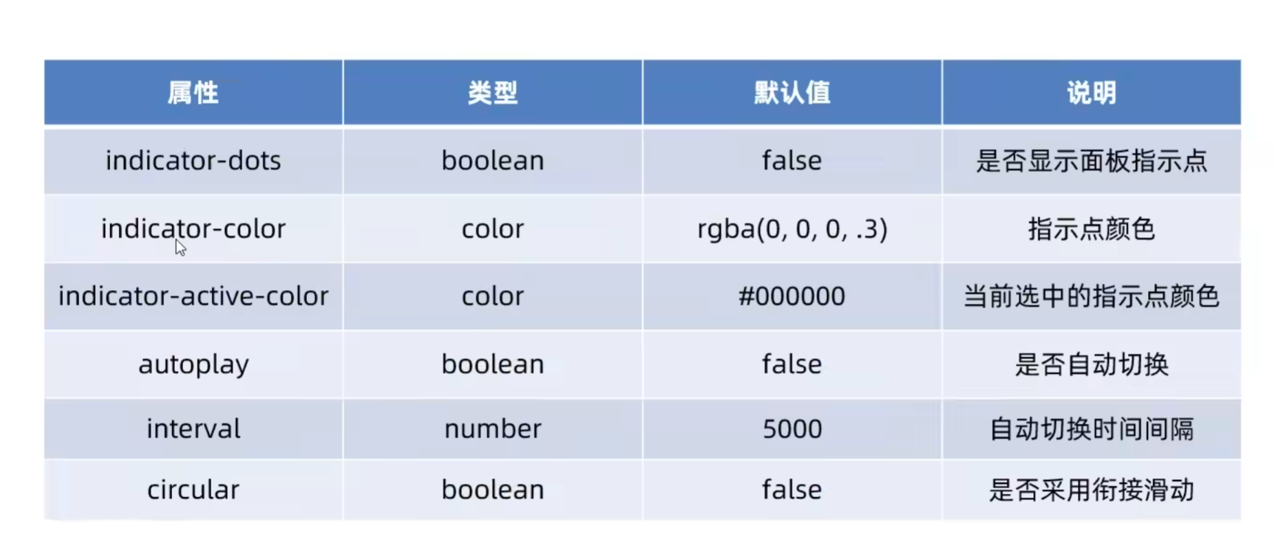
(3)轮播图
<!-- 轮播图结构 -->
<swiper class="swiper-container" indicator-dots indicator-color="blue" indicator-active-color="red" autoplay interval="2000" circular>
  <swiper-item>
    <!-- 第一个轮播图 -->
    <view class="item">A</view>
  </swiper-item>
  <!-- 第二个轮播图 -->
  <swiper-item>
    <view class="item">B</view>
  </swiper-item>
  <!-- 第三个轮播图 -->
  <swiper-item>
    <view class="item">C</view>
  </swiper-item>
</swiper>
样式:
.swiper-container {
  height: 150px;
  /* background-color: rgb(193, 173, 230); */
}

.item {
  height: 100%;
  line-height: 150px;
  text-align: center;
}

swiper-item:nth-child(1) .item {
  background-color: lightgreen;
}

swiper-item:nth-child(2) .item {
  background-color: lightblue;
}

swiper-item:nth-child(3) .item {

  background-color: lightpink;
}
(4)text相当于span,添加user-select属性才可以长按选中
<view>
  手机号支持长按选中
  <!-- <text selectable> 23年之前-->
  <text user-select="true">
    13288776655
  </text>
</view>
(5)使用rich-text渲染html属性
<rich-text nodes="<h1 style='color:red;'>标题</h1>"></rich-text>
(6)button按钮
<!-- 通过type属性指定按钮颜色类型 -->
<button>默认按钮</button>
<button type="primary">主色调按钮</button>
<button type="warn">警告按钮</button>
<!-- size='mini' 小尺寸按钮 -->
<button size='mini'>默认按钮</button>
<button type="primary" size='mini'>主色调按钮</button>
<button type="warn" size='mini'>警告按钮</button>
<!-- plain 镂空按钮 -->
<button size='mini' plain>默认按钮</button>
<button type="primary" size='mini' plain>主色调按钮</button>
<button type="warn" size='mini' plain>警告按钮</button>
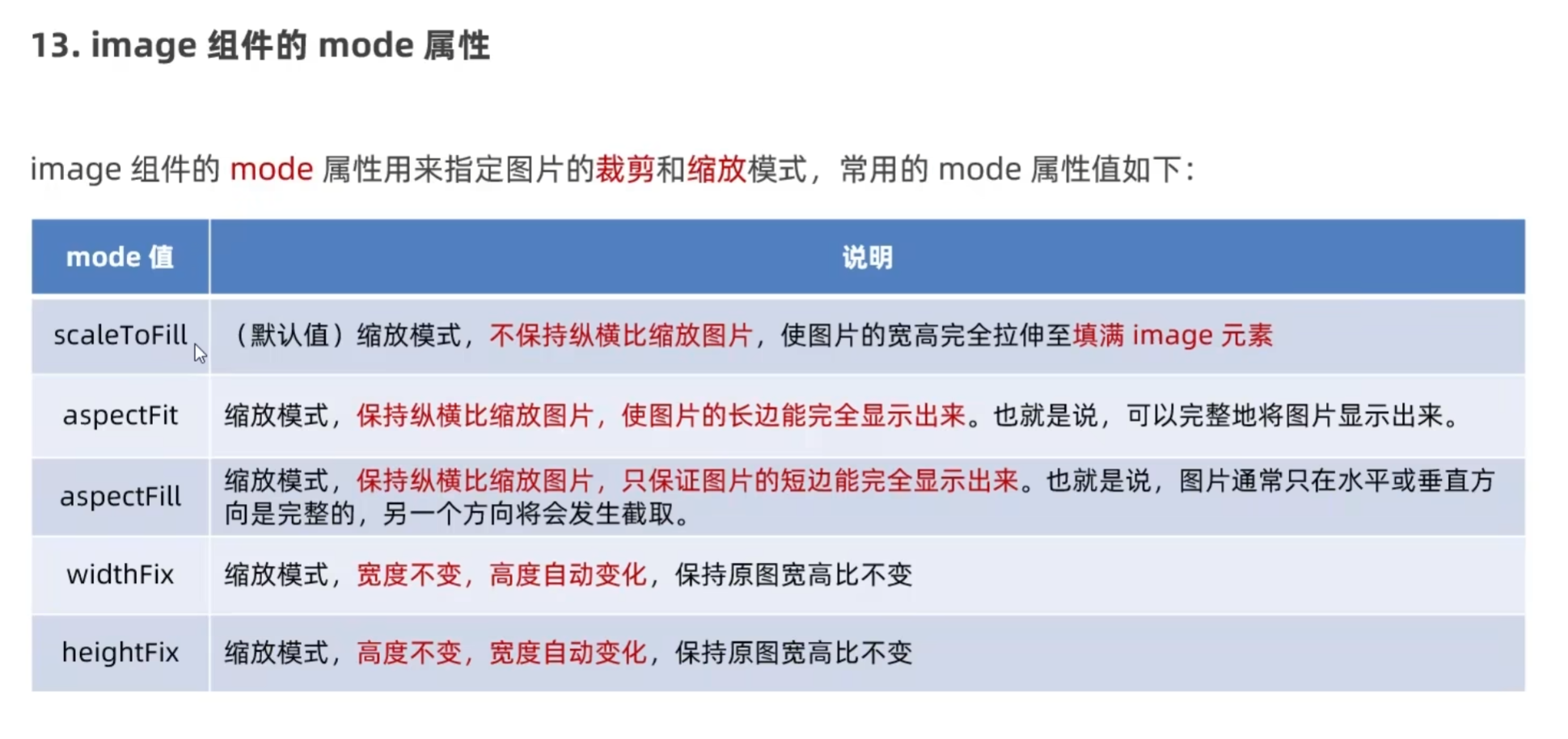
(7)image标签
<!-- 空图片 -->
<image></image>
<!-- 使用src指向图片路径 -->
<image src="/images/1.png"></image>
<image src="/images/1.png" mode="aspectFit"></image>
<image src="/images/1.png" mode="aspectFill"></image>
<image src="/images/1.png" mode="widthFix"></image>
<image src="/images/1.png" mode="heightFix"></image>