炫酷loading css实现
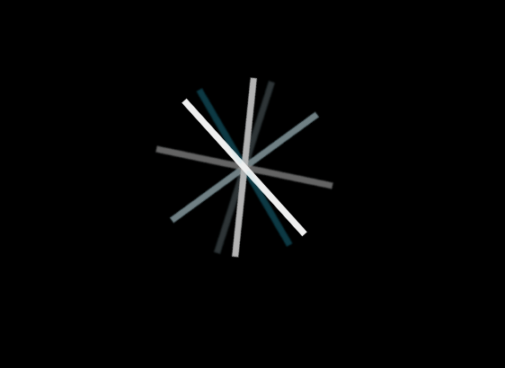
实现效果
代码
本文使用react实现,其他同理
index.js
import React from 'react';
import s from './index.less';

export default function Loading() {
    return (
        <div className={`${s['loading-container']} ${s['loading-active']}`}>
            <div className={s['loading-progress']}>
                <div className={s.rotator}>
                    <div className={s.rotator}>
                        <div className={`${s.rotator} ${s.colored}`}>
                            <div className={s.rotator}>
                                <div className={`${s.rotator} ${s.colored}`}>
                                    <div className={`${s.rotator} ${s.colored}`}></div>
                                    <div className={s.rotator}></div>
                                </div>
                                <div className={`${s.rotator} ${s.colored}`}></div>
                            </div>
                            <div className={s.rotator}></div>
                        </div>
                        <div className={s.rotator}></div>
                    </div>
                    <div className={s.rotator}></div>
                </div>
                <div className={s.rotator}></div>
            </div>
        </div>
    )
}
index.less
.loading-container {
  z-index: 2000;
  position: fixed;
  top: 0;
  left: 0;
  right: 0;
  bottom: 0;
  background: rgba(0, 0, 0, .55)
}

.loading-container.loading-inactive {
  display: none
}

.loading-container.loading-inactive .loading-progress {
  display: none
}

.loading-container .loading-progress {
  z-index: 2000;
  position: fixed;
  height: 10px;
  width: 10px;
  margin: auto;
  top: 0;
  left: 0;
  right: 0;
  bottom: 0
}

.loading-container .loading-progress .rotator {
  -webkit-animation: spin 30s infinite linear;
  -moz-animation: spin 30s infinite linear;
  -o-animation: spin 30s infinite linear;
  animation: spin 30s infinite linear
}

.loading-container .loading-progress>.rotator {
  left: -100px
}

.loading-container .rotator {
  -webkit-background-origin: border-box;
  -moz-background-origin: border-box;
  background-origin: border-box;
  background-color: #fff;
  width: 200px;
  height: 7px;
  opacity: .75;
  position: absolute;
  top: 0;
  left: 0
}

.loading-container .colored {
  background-color: #2dc3e8 !important
}


@keyframes spin {
  0% {
    -webkit-transform: rotate(0deg);
    -moz-transform: rotate(0deg);
    -ms-transform: rotate(0deg);
    transform: rotate(0deg)
  }

  100% {
    -webkit-transform: rotate(360deg);
    -moz-transform: rotate(360deg);
    -ms-transform: rotate(360deg);
    transform: rotate(360deg)
  }
}